To do expand my research I have create a survey as a primary resorce for research.
Here is the link to the survey http://www.surveymonkey.com/s/5M5LNXK.
Thursday, 29 September 2011
Monday, 26 September 2011
Product Research - Additional Examples Of Music Videos
Here are additional examples of the music videos in this genre to get a better overall understanding:
I havent analyised these but they have expanded my indeas of the conventions of the indie music video genre as they contain simliar features to the videos that I have analysed. The Foals video features iconography such as the crow and the clothing is in fashion with the shirts and the jeans. The Tokyo Police Club video has a middle class urban enviroment which is simliar to the Bombay Bicycle Club videos of the Indie genre and the Band Of Horses video is distinct as it is filmed with a old film camera. This is similar to the use of the VCR in the Bombay Bicycle Club video as they both have old vintage feels to them.
I havent analyised these but they have expanded my indeas of the conventions of the indie music video genre as they contain simliar features to the videos that I have analysed. The Foals video features iconography such as the crow and the clothing is in fashion with the shirts and the jeans. The Tokyo Police Club video has a middle class urban enviroment which is simliar to the Bombay Bicycle Club videos of the Indie genre and the Band Of Horses video is distinct as it is filmed with a old film camera. This is similar to the use of the VCR in the Bombay Bicycle Club video as they both have old vintage feels to them.
Product Research - Goodwins Theory
Andrew Goodwin's theory is based upon the conventional features of the music video, regardless of the genre of music. The key features he has identified are:
- A relationship between the lyrics and the visuals, with the visuals illustrating, amplifying or contradicting the lyrics.
- A relationship between the music and the visuals, with the visuals illustrating, amplifying or contradicting the music.
- Intertextual references to other media texts may be present.
- Multiple close-ups of the main artist or vocalist.
- Genre-related style and iconography present.
- Voyeurism often plays a major part, especially in relation to females.
Further more he states that the music video is a representation or link between visuals and the song. There are also promotional elements in the song including the close ups of the band members and the performance of the band makes it look live so it makes the audience want to see the band at a concert. Finally voyeurism is used to amplify the videos attractiveness, especially females while intertextuality is used in more humorous videos.
Goodwin's theory is demonstrated in the videos I have previously analysed:
 Here in the 'Always Like This' song there is multiple shots of the band peroforming with their instruments which supports the promotional points.
 Here is a medium close up of the main singer which is demonstrating his energetic personality and is passion to sing to the audience. This also is promotional to the band.
- A relationship between the lyrics and the visuals, with the visuals illustrating, amplifying or contradicting the lyrics.
- A relationship between the music and the visuals, with the visuals illustrating, amplifying or contradicting the music.
- Intertextual references to other media texts may be present.
- Multiple close-ups of the main artist or vocalist.
- Genre-related style and iconography present.
- Voyeurism often plays a major part, especially in relation to females.
Further more he states that the music video is a representation or link between visuals and the song. There are also promotional elements in the song including the close ups of the band members and the performance of the band makes it look live so it makes the audience want to see the band at a concert. Finally voyeurism is used to amplify the videos attractiveness, especially females while intertextuality is used in more humorous videos.
Goodwin's theory is demonstrated in the videos I have previously analysed:


Sunday, 25 September 2011
Product Research - Promotional Advert Analysis 3
Feeder - Renegades
 The Feeder advert is very bold and simple. It lets the audience know the name of the band straight away and as you read down it gives only basic information.
 The photograph is a studio shot and is quite expressionistic with the name of the album on a naked woman with strange mise en scene objects. This therefore makes the advert stand out and will draw the audiences attention further.
Little information is given on the poster apart from the web address at the bottom right. Therefore the audience are expected to know where to buy the album and if in doubt visit the website which will also draw their attention to other promotional media texts of the band.
Product Research - Promotional Advert Analysis 2
Noah And The Whale - The First Days Of Spring
 This advert is very minimalistic and traditional. The photograph is the band stoof in a field and the lead singer taking a photograph/film of the camera this photo was taken with. This creates a direct connection with the audience. The mise en scene of the costumes of summery shirts and the grass in the field have connotations of the season Spring, which is the title of the album. The photograph is the same one from the album cover so this helps the audience relate the different media texts of the band with the iconic photo. The photograph is colour graded to a pastell colour feel which conotes neutral emotions which can be related to the album.
 This advert is very minimalistic and traditional. The photograph is the band stoof in a field and the lead singer taking a photograph/film of the camera this photo was taken with. This creates a direct connection with the audience. The mise en scene of the costumes of summery shirts and the grass in the field have connotations of the season Spring, which is the title of the album. The photograph is the same one from the album cover so this helps the audience relate the different media texts of the band with the iconic photo. The photograph is colour graded to a pastell colour feel which conotes neutral emotions which can be related to the album.
Product Research - Promotional Advert Analysis 1
The Subways - Money and Celebrity
This is a HMV exclusive promotional advert, primarly trying to make the audience shop at HMV for the album. It is very detailed, with a lot of different information including the price, a studio shot of the band and the album. As well as additional information on the album and of HMV.
This is a HMV exclusive promotional advert, primarly trying to make the audience shop at HMV for the album. It is very detailed, with a lot of different information including the price, a studio shot of the band and the album. As well as additional information on the album and of HMV.
 The studio shot, which takes up the entire page, directly addresses the audience as the entire band are looking at the camera. Therefore as the audience look at the page, their eyes make contact with the band and they look at the other features of the page. The medium 3 shot of the band is done for the audience to recognise the band as The Subways that have not been in the spotlight for a while. The black costumes of the band sopport this as further as the audiences eyes only take notice of the faces of the band.
There is also a picture of the album, which lets the audience know the appearance of it when they are looking for it in HMV or other record stores.
Finally the font is simple and minimalistic which makes it easy for the audience to read. This is most likely because there is a lot of information to read on the page.
Thursday, 22 September 2011
Product Research - Album Cover Analysis 3
Foals - Total Life Forever
 Total Life Forever is the second album by the the British Indie Rock band Foals. It was released 10th May 2010 by Transgressive Records.
 Filling the entire album cover, the picture blends well with the titles as the white sunbeam makes the text stand out. Throughout the picture, it appears that there gradient from the bottom where it is dark to the top where it is light. This relates to the name of the album as the band seem to be trying to swim through a current and as the light connotes life and the dark connotes death, the band may be struggling to 'live forever' which relates to the name of the album.
 Total Life Forever is the second album by the the British Indie Rock band Foals. It was released 10th May 2010 by Transgressive Records.
The album itself does not have a main point that draws the audience to it, the title, blue water and the people could be looked at first when the audience first see it. However the title stands out with the san serif, bold, black font which makes it easy to recognise the title of the album and the artist which makes it easy for the audience to understand the information of the album.
 Filling the entire album cover, the picture blends well with the titles as the white sunbeam makes the text stand out. Throughout the picture, it appears that there gradient from the bottom where it is dark to the top where it is light. This relates to the name of the album as the band seem to be trying to swim through a current and as the light connotes life and the dark connotes death, the band may be struggling to 'live forever' which relates to the name of the album.
The water and swimming also relates strongly to the music video of a song on the album; Spanish Sahara. This links the different promotion techniques of the band together and therefore lets the audience recognise the band from their other promotional media texts, such as the music video.
Tuesday, 20 September 2011
Product Research - Album Cover Analysis 2
Bombay Bicycle Club - Evening / Morning


Evening / Morning is the debut single from Bombay Bicycle Club, which was released 4th August 2008 by the independant record label: "Young and Lost Club".
First look at the album is quite stricking. The strong red contrasting with he black shadows of the face of what looks like frankinsteins monster breaks the conventions of the genre. Similar to album Flaws the cover contains a photograph, the title of the band and album and nothing else, which is common for this band.
The contrasting colours of red and black could invoke the emotions of passion and oppression which can relate to the title; Evening / Morning as in the evening it is dark and cold and in the morning the sun is bright and could connote passion. This is one interpretation of this.
The photo of the monster is looking down which is similar to flaws as it connotes depression. However the photo on this album is in a lot less detail which makes the emotions stand out more on the eyes and mouth which could relate back to the contrasting point of the colour.
On the forehead of the monster is a moderately hard to read title of the single. The font looks a lot like smudged blood which is reinforced with the red colour scheme. This may represent also that the evening and morning is merging which can be related to the single.
Product Research - Album Cover Analysis 1
Bombay Bicycle Club - Flaws
 Flaws is the second album from Bombay Bicycle Club released 9th May 2009.
The album artwork is overall quite simplistic as it features only an extreme close up of a woman with no other mise en scene which is done to focus the audience on the photo of the woman. The woman portrayed to be depressed as her head is tilted and her eyes are looking down. This could relate to the music on the album as the songs could be relating to the sorrow / depression of women. This is supported further with the post-production of the photograph.
 The colour grading has made the picture dark on the lows of the colour and light on the highs of the colour which expresses the lighting on the right side of the photo. With the use of this technique it connotes that there is two sides of the woman in some way. For instance a happy and sad emotion or certain ideas relating to songs on the album. The colour scheme is a de-saturated red which represents a faded or little passion, which may relate to the songs on the album.
The banner to left is quite unusual as it is placed vertical on the album cover and is read top to bottom. This therefore is the second item on the cover that the audience looks at because they have to change their eye line from the default horizontal look which is the composition of the photograph of the woman. Therefore this denotes that the photograph is more important than the title of the band and name of the album. This is supported further with the white thin font on the black background which is contrasting and creates a simplistic feel and does not draw the audiences attention very well.

Monday, 19 September 2011
Product Research - Music Video Analysis 3
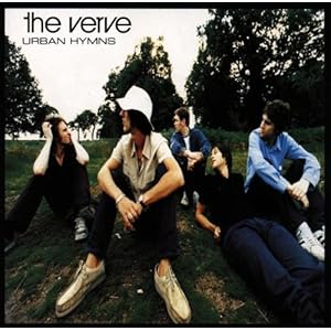
The Verve - Bitter Sweet Symphony

 With over 29 million views on YouTube, this is one of the most famous music videos of the Indie genre. Bitter Sweet Symphony is the 1st track on The Verves 1997 album Urban Hymes.
The video follows the storyline of a man (the lead singer) down one long street. Throughout, it expresses a lot of emotions and by watching the video several times, I have interpreted it as the man is walking through society and being rejected because he cannot change to suite how society wants him to be. The emotion on his face is very statically fierce and this could be because he 'Can't change his mould', which is a lyric in the song. This is supported by the dark colours in the video which darken his face and especially his eyes.
The location is very important to the storyline of the video. The location is one straight path and it is followed constantly throughout. This represents that the path cannot be changed by the main character in the video which is denoted even further by the arrogance he shows as he does not move out of the way for people even cars. He passes a variety of different people but they can be catorgorise in a certain group. They seem quite low/middle class and because of this, it can be interpreted as he is sad and depressed with his place in society and would like to be richer and more important.

The performance is shown only by the lyrics sang by the lead singer and the other members of the band are not included. This connotes that the video is not about the performance of the song at all but just the entirely about the meaning of the song as the lyrics are the only 'instrument' in the video.
Old, worn and mostly lower class clothing appears in the video and the main character is wearing black and a leather jacket. The leather jacket connotes the main character to be strong and aggressive, as leather jackets are associated with male motor bikers and motorbike gangs. The old worn out clothing of the other people in the video express the lower class feel of the video even further.
The video:
Product Research - Music Video Analysis 2
Bombay Bicycle Club - Magnet
 Joining Always Like This on the album I Had The Blues But I Shook Them Loose, Magnet is the 7th track.
 The music video supports the song very well throughout. Firstly the storyline is quite hidden, just like the Always Like This video however the storyline can be interoperated as the following. As the band are trapped in the room with a closed door there is a variety of videos being projected onto the walls of the room. Predominantly containing different women and especially when the line of the song; 'Which one will stay, which one will say goodbye'. This therefore could mean that the members of the band are related to these women and are confused to which women will stay with them or leave them. This moves onto the location of the music video which is in the white room. Being in the room for the entire video this connotes that the band cannot decide who will go or stay and until they do they will be trapped with the thoughts being projected on them.
 Overall the video has a very artistic feel to it, the projection of the video on the band completely changes the mood of the video. The projection is similar to the VHS in the 'Always Like This' vide and connotes the same meaning as I previously discussed in the last analysis. As the brightness of the projection connotes happiness but the part in the video when the brightness drops and the band is in shadows represents a more sad and sinister feel to the video.
The clothing is very similar to the Always Like This with casual clothing but it is appearing that the clothing in the videos seems to follow the fashion trends of the current time which could be done to relate to the target audience of the band.
Finally the performance of the band is important to the video. They are featured throughout the video but they are also very energetic. This relates to the storyline as the decisions are hard and being trapped in the room can make you very relentless. Spotlighting the singer also ammedes the feel of a performance as it is similar to the theatre. The constant featuring of the band can also be used to promote the liveliness and style of the band, which could confince the audience to purchese tickets for their live performances.
 Joining Always Like This on the album I Had The Blues But I Shook Them Loose, Magnet is the 7th track.
 The music video supports the song very well throughout. Firstly the storyline is quite hidden, just like the Always Like This video however the storyline can be interoperated as the following. As the band are trapped in the room with a closed door there is a variety of videos being projected onto the walls of the room. Predominantly containing different women and especially when the line of the song; 'Which one will stay, which one will say goodbye'. This therefore could mean that the members of the band are related to these women and are confused to which women will stay with them or leave them. This moves onto the location of the music video which is in the white room. Being in the room for the entire video this connotes that the band cannot decide who will go or stay and until they do they will be trapped with the thoughts being projected on them.
The clothing is very similar to the Always Like This with casual clothing but it is appearing that the clothing in the videos seems to follow the fashion trends of the current time which could be done to relate to the target audience of the band.
Finally the performance of the band is important to the video. They are featured throughout the video but they are also very energetic. This relates to the storyline as the decisions are hard and being trapped in the room can make you very relentless. Spotlighting the singer also ammedes the feel of a performance as it is similar to the theatre. The constant featuring of the band can also be used to promote the liveliness and style of the band, which could confince the audience to purchese tickets for their live performances.
The video:
Saturday, 17 September 2011
Product Research - Music Video Analysis 1
Bombay Bicycle Club - Always Like This

Always Like This is the 6th track on Bombay Bicycle Clubs' debut album; I Had The Blues But I Shook Them Loose released 7th July 2009. The genre for this album is classified as Indie on last.fm and Alternative on the iTunes store.
 The video primarily uses the themes of a VCR playing back the performance of the band in a variety of lower/middle class urban housing estates, which supports the repeated lyrics of the song; 'I'm not whole' as the locations are not wealthy. The VCR effect also speeds up and slows down which supports this line of the lyrics as it is made to feel like the videos missing parts out. It also adds an old, cheap feel to the video, which relates to the Indie rock genre as they are not using new expensive technologies. The VCR could also help relate the audience who are sat at home most likely watching the music videos on social networking sites such as YouTube or the music channels on TV with the band because it could remind them of their home videos, reinforced by the locations, costume and budget of the video as well.
The clothing in the video is very casual. Worn out trainers, simple printed T-shirts, jeans, hoodies and checked shirts created this casual feel. This costume setup supports the lower/middle class theme of the video.
 Urban housing is the primary theme for the locations, including a variety of different semi detached houses, garage block and small high street stores such as a off license and a corner shop. These locations are very common all around England. This would make it very easy for the target audience to relate to the band and their locations. Locations such as these do not require a large budget to film on which relates to the Indie genre of the band since independent record labels are quite small unlike the large record labels.
Moving onto the performance side of the video, the band is featured nearly always during the video which moves a separate narrative out of the video, therefore giving focus to the band itself. The band performs with only their guitars and the bare minimum of percussion instruments. This lack of technical equipment lowers the feeling of a large live performance in a venue but concentrates only on the emotion and technicality of the music being played as well as supporting the low independent budget as well.
The colours video is quite desaturated, which gives a more rugged and smaller budget to the video. There is a varied colour pallet within the mise en scene which avoids any stereotypical themes of other genres such as Metal where the colours are quite dark throughout the videos.
The video:
Monday, 12 September 2011
Initial Ideas
Band
Bombay Bicycle Club
Song
How Can You Swallow So Much Sleep
Genre
Folk/Indie/Alternative
Location(s)
Urban City
Costumes
Casual Clothing - Jeans, T Shirts, Checked Shirts, Sports Shoes
Storyline
Explores the ideas of choosing the path in life that is for you. These include searching for inspiration, love and affection, the relentlessness of these paths and where they will take you and finish.
Performance
Entergetic, performance of the song done by street performers
Style
Upbeat, dynamic storyline
Colour
De-saturated colours, mix between dark and light
Initial Research
What is a digipak?
A digipak is an alternative to a jewel case (a hard plastic opening case) to hold a CD or DVD. It is usually paperback or cardboard with print on all sides of the gate fold opening. Record Companies and Publishers mostly use digipaks for special edition versions of the CD or DVD and would contain extra features such as special edition photos and booklets.

How are albums marketed?
Albums are marketed in several ways including promotional music videos which are released on different media platforms such as television, the internet including one of the biggest music video website YouTube. There are also advertisements on these media platforms that promote the album itself including the tracks that are featured and the date that the album will be released. Albums are also promoted at festivals, posters and by the record companies other labels. The actual album itself relies on the presentation of the CD case to catch the audiences eyes in the stores such as HMV, Tescos and online websites.


The Arctic Monkeys album is a simple photo of the band members with the name of the Artist and no album name. This therefore means the audience shuold know the album from the cover photo and name which attracts the audience who already know who the band are. The Limp Bizkit album features both the name of the band and the name of the album. This makes it easy for the audience to find what the album is. The photo is quite bizzare and unique which draws the audiences attention. Finally The XX debut album is meerly just an 'X' with no other information. This is an alternative way of attracting the audience as they will become curious to what album it is by turning it over, reveling the name of the band and the album name.
Statement of Intent
I’m Thomas Faulkner studying A2 Media Studies at York College. This blog is dedicated to the portfolio of the A2 Media Studies coursework. Previously I have created a similar portfolio for AS Media Studies that I completed last college year. The URL for this blog is http://tomfaulknermedia.tumblr.com, which is a Music Magazine project. The project this time will be different as it will cover the planning, production and evaluation of a music video and a digipak that will coincide with this. This will be different as the previous coursework covered only the print based side of the media, however this time, along with the print based media I will introduce video media. Throughout this blog the work will be displayed in multiple media formats to ensure the coursework will be easily accessed and understood.
During this project I wish to widen my knowledge of the different media areas. As I am a keen photographer and video maker I hope to learn new techniques and management skills which will help me in the future. Such as timing, budget and organization of the cast and crew that will be needed. I am also very interested in the production area of video making so I hope to gain more experience with the equipment needed to film the music video and the digital editing software that will be used as well. I hope to gain skills throughout the digipak side of the coursework. I hope to widen the knowledge that I learned in the previous coursework and create and more professional look to it.
During this project I wish to widen my knowledge of the different media areas. As I am a keen photographer and video maker I hope to learn new techniques and management skills which will help me in the future. Such as timing, budget and organization of the cast and crew that will be needed. I am also very interested in the production area of video making so I hope to gain more experience with the equipment needed to film the music video and the digital editing software that will be used as well. I hope to gain skills throughout the digipak side of the coursework. I hope to widen the knowledge that I learned in the previous coursework and create and more professional look to it.
Subscribe to:
Comments (Atom)